3,000 search results
(0.017 seconds)
- REDRING 1969 - Unknown license

- 1979 - Unknown license

- 1769 by Almarena,
$22.00 1769® Display is an elegant and modern serif typeface inspired by the history of France and more particularly the Romantic movement (1700s and 1800s). The roundness of its characters and its numerous ligatures reflect the grace, refinement and sensitivity that were omnipresent during the 18th century. Its name refers to the birth of Napoleon Bonaparte, the fascinating or revolting emperor, the emblematic figure of this period.
 - Al Chevrola by Aluyeah Studio,
$80.00 Al Chevrola is a dynamic modern sans serif. Strong, with curves and an elegant touch. It is a rounded, geometric near-monoline construction sans serif typeface with display details which gives it modern, simple, elegant, chic, cool, and strong vibes. Each style and character looks amazing in large headlines. Al Chevrola works great in branding, logos, magazines, packaging. FEATURES: 4 Weight OpenType support Easy to use (with special combination) Multilingual support (15 languages) PUA Encoded Thanks for checking out Al Chevrola. I really hope you enjoy using it! If you have any questions I'd be more than happy to answer them, just send me a message.
 - laundromat 1967 - Unknown license

- USIS 1949 - Personal use only

- Mage 1999 - Unknown license

- 1669 Elzevir by GLC,
$42.00 This family was inspired from the set of font faces used in Amsterdam by Daniel Elzevir to print the famous “Tractatus de corde...” the study on earth anatomy by Richard Lower, in 1669. The punch cutter was the famous Dutch Kristoffel Van Dijk. In our two styles (Normal & Italic), font faces, kernings and spaces are scrupulously the same as in the original. This Pro font covers Western, Eastern and Central European languages (including Celtic), Baltic and Turkish, with standard and “long s” ligatures in each of the two styles. The Roman (Normal) style contains a U stylistic alternate, and the Italique style A.
 - Hurley 1967 by Tyfomono,
$16.00 Hurley 1967 is a bold script, with clean lines and smooth curve combined with beautiful features! Simply amazing fonts, comes with 7 styles. Hurley 1967 has a bunch of styles as a families to designed lettering style logotype using the fonts.
 - 1968 GLC Graffiti by GLC,
$38.00 This font was inspired by the paint brushed letters in use in the 60 - 70s for protest slogans tagged on the cities walls. In those days, we didn't commonly use aerosols like today, so we used paint brushes, with paint or tar cans, drew the letters, and ran away quickly ! Capitals and lower case have the same size, and a lot of alternates characters or ligatures allows the user to vary each letter (until tree alternates for single letters) in each word of a text . Likewise, the words may be easily underscored or intersected by a few stains looking like paint spots, substituted to the following standards characters: [greater], [less], [dagger], [backslash], [bullet], and [underscore].
 - Heavy Heap - Unknown license

- Green Fuz - Unknown license

- Rackem PB by Pink Broccoli,
$14.00 Rackem PB started as a digitization of a film typeface known as "Eightball" by LetterGraphics, not to be confused with Eightball that was released by other film type companies of a totally different look. This crazy typestyle had all the flavor it needed to make regular appearances in 70's sticker body modification ads for Chevrolet cars and trucks side panels. Loaded with hooptie appeal, it's something you really need to take for a ride to appreciate its novelty.
 - Pistoletto by Etewut,
$22.00 Introducing Pistoletto script. I was inspired by works of Roy Lichtenstein and Michelangelo Pistoletto. There are 4 fonts that in different combinations make interesting results: Background, Black, Highlight, Regular. Each style supports European languages. Basic latin has uppercase alternates, two lowercase alternates, many ligatures and swashes. I used for display pictures following works of Roy Lichtenstein: Pistol (1964), Engagement Ring (1961), Oh, Jeff...I Love You, Too...But... (1964), Seductive Girl, Yellow Brushstroke I (1965), Brushstroke (1965).
 - Mexcellent - Unknown license

- Magical Mystery Tour Outline Shadow - Unknown license

- Headshop - Personal use only

- Victor Moscoso - Unknown license

- Harry Pro by Red Rooster Collection,
$60.00This revival of Harry is based on the original design by Marty Goldstein (and C.B. Smith). Goldstein, born in Chicago in 1939, was the co-founder of the groundbreaking Creative Black Book. He graduated from the Pratt Institute in 1960. Harry, first published by VGC in 1966, was named for his father. ITF has added four new weights to the original six. - Cornelius by Artcity,
$19.00 Cornelius is a playful hand-drawn font family designed by Daniel Bak (Artcity). It is available in three handy weights: regular, bold and screaming. It contains international language accent marks and diacriticals, including Greek and Cyrillic in both OTF and TTF formats. Font family name is inspired by the main male ape character from the 1968 science fiction film Planet of the Apes and Pierre Boulle novel of the same name. Boulle published his La Planète des singes in 1963, which was originally translated in 1964 as Monkey Planet by Xan Fielding, and later re-issued as Planet of the Apes . Dr. Cornelius is a chimpanzee archaeologist and historian who appears in the original novel, and also the first three installments of the classic movie series, from the 1960s and 1970s. He was portrayed mainly by actor Roddy McDowall, but also by David Watson.
 - Telingater Display by ParaType,
$30.00 PT Telingater Display™ was designed in 1959 by a well-known Soviet book designer Solomon Telingater (1903-1969) at Polygraphmash type design bureau. The typeface was awarded the Silver Medal at the International Book Art Exhibition (IBA-59) at Leipzig (Germany) in 1959. Light flared sans serif with calligraphic flavor and low contrast between main strokes and hairlines. For use in title and display typography. The digital version was developed for ParaType in 2001 by Lyubov Kuznetsova.
 - Norumbega Demo - Unknown license

- Ad Lib by SoftMaker,
$15.99 Ad Lib was created by Freeman Craw for ATF in 1961. Sporting irregular character shapes, this informal typeface makes a good impression when a 1960s look is desired in advertising and display work.
 - Anderson Thunderbirds Are GO! - Unknown license

- Teenagers JNL by Jeff Levine,
$29.00 Inspired by the hand lettered opening credits for “(The Many Loves of) Dobie Gillis” – a teen-oriented televisioncomedy that ran from 1959 to 1963 on CBS - Teenagers JNL is available in both regular and oblique versions.
 - Svetlana by ParaType,
$30.00 Designed in 1976–81 by Michael Rovensky (1902–1996) as the body text companion of his Bazhanov Display typeface (1961), of Polygraphmash typefoundry. Based on the lettering by Moscow book designer Dmitry Bazhanov (1902–1945). With old-fashioned flavor, this design recreates the Soviet hand-lettering style of the 1940s. The digital version was developed at ParaType in 1996 by Lyubov Kuznetsova.
 - Groovy Tuesday JNL by Jeff Levine,
$29.00 Hand lettering from the 1965 movie poster for “The Loved One” – a classic 1960s spurred serif design with added curly-tailed terminals was the working model for Groovy Tuesday JNL – available in both regular and oblique versions.
 - Hapshash by K-Type,
$20.00 Hapshash is an all capitals font inspired by the 1960s psychedelic posters of British designers Hapshash and the Coloured Coat (Michael English and Nigel Waymouth), in particular their 1968 poster for the First International Pop Festival in Rome.
 - AbbeyRoad - Personal use only

- Madison Antiqua by Linotype,
$29.99Madison Antiqua was original released as a metal typeface for hand-setting in 1965. The letters were produced by D. Stempel AG in Frankfurt, Germany. Their design was based heavily on an earlier German typeface named Amts-Antiqua, which had also been produced by Stempel. Amts-Antiqua is credited to Henrich Hoffmeister, and he developed it between 1909 and 1919. Madison Antiqua is an excellent selection for body text in magazines and newspapers. The typeface features a characteristic x-height, and attention-grabbing serifs. For a time, Madison Antiqua was associated with advertising design, because of its namesake: Madison Avenue in New York. Madison Avenue is a global center of advertising excellence. - Victor Moscoso by K-Type,
$20.00 The Victor Moscoso font is based on the 1960s psychedelic poster lettering of the artist Victor Moscoso. The letterforms are derived from some of his most celebrated Neon Rose posters of the late sixties, in particular the archetypical Moby Grape ‘Neptune’s Notion’ of 1967.
 - Corrida by ParaType,
$25.00Designed for ParaType (ParaGraph) in 1989 by Elvira Slysh. Based on Slogan of Ludwig & Mayer type foundry, 1959, by Helmut Matheis. An informal flowing script simulating pointed brush calligraphy. A style of medium weight and coherent lowercase. For use in advertising and display typography. - Motoya Maru Aporo by Motoya,
$229.00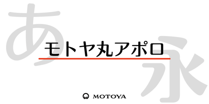 ???????????????????????????????????????????????????????????????????????????????????????????????????????????????????????????????????????????????????????????????1969??????????????????????????????????????????????????????????????????????????
 - Motoya Aporo by Motoya,
$229.00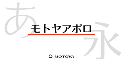 ????????????????????????????????????????????????????????????????????????????????????1969???????????2??????????????????? ????????????????????????????????????????????????????????????????????????????????????????????
 - Lysergic by Mysterylab,
$24.00 Lysergic is a smoky, swirly, super-psychedelic font that exudes 1960s vibes. This font is a tribute to the work of San Francisco artist Rick Griffin, famous for his psychedelic posters, creative lettering ideas, and especially his Grateful Dead album cover art. Griffin was a master of ink stippling and that particular drawing technique proves to be a great way to embellish this style of lettering. Set your time machine to 1969 and fire up your grooviest designs with Lysergic.
 - Eckhardt Trilinear JNL by Jeff Levine,
$29.00 Eckhardt Trilinear JNL was inspired by [and modeled from] a pen-drawn alphabet found in a 1960 edition of the Speedball® lettering textbook. As with many other "sign painter-oriented" typefaces by Jeff Levine, it is named in honor of Jeff's good friend -- the late Albert Eckhardt, Jr. Al ran Allied Signs in Miami, Florida from 1959 until his passing.
 - SchoolBook by ParaType,
$30.00The typeface was designed at the Polygraphmash type design bureau in 1949-61 (project manager Elena Tsaregorodtseva). Based on Shkolnaya ('School') typeface, 1939 (project manager Evgeny Chernevsky), a version of Century Schoolbook of American Type Founders, 1915-1923 by Morris F.Benton. The low-contrast text typeface of the Ionic-Legibility group, it is designed expressly for schoolbooks and children books. - Bazhanov by ParaType,
$30.00 PT Bazhanov™ was designed at Polygraphmash type design bureau in 1961 by Michael Rovensky (1902-1996). Based on the lettering by Moscow book designer Dmitry Bazhanov (1902-1945). Old-fashioned flavor of this design recreates the Soviet hand-lettering style of the 1940s. For use in title and display typography. The digital version was developed for ParaType in 2001 by Lyubov Kuznetsova.
 - Eckhardt Showcard JNL by Jeff Levine,
$29.00Eckhardt Showcard JNL and Eckhardt Showcard Two JNL are drawn from more lettering found in an old sign painting book. Jeff Levine has continued naming a series of fonts for the late Albert Eckhardt, Jr. (1929-2005) who had owned Allied Signs in Miami, Florida from 1959 until his passing. Al was a talented lettering artist and a good friend to Jeff. - Octava by ParaType,
$30.00 PT Octava™ was designed at ParaType in 2001 by Vladimir Yefimov. The first (Cyrillic only) version named Scriptura Russica (1996) consisting of three styles (book, italic, bold) was commissioned by the Russian Bible Society. Lately the Latin letters and bold italic were added. Inspired by Lectura, 1969, by Dick Dooijes and Stone Print, 1991, by Sumner Stone. In spite of large x-height the typeface is both space saving and quite legible at small sizes. Expert fonts including small caps (book) and old style figures are available.


Page 1 of 75Next page